
Mega Bog is an experimental pop ensemble led by musician Erin Elizabeth Birgy. Living against the backdrop of lockdowns and forest fires in 2020 — surrounded by seemingly endless turmoil — Birgy produced Mega Bog’s seventh album, End of Everything. The record speaks of surrender, of mourning, and of support in the face of tumultuous self-reflection. Together we collaborated to create visual elements that complemented and compounded the record’s sonic and lyrical achievements.
Featured in Our Culture’s 50 Best Album Covers of 2023 →
01
Design System
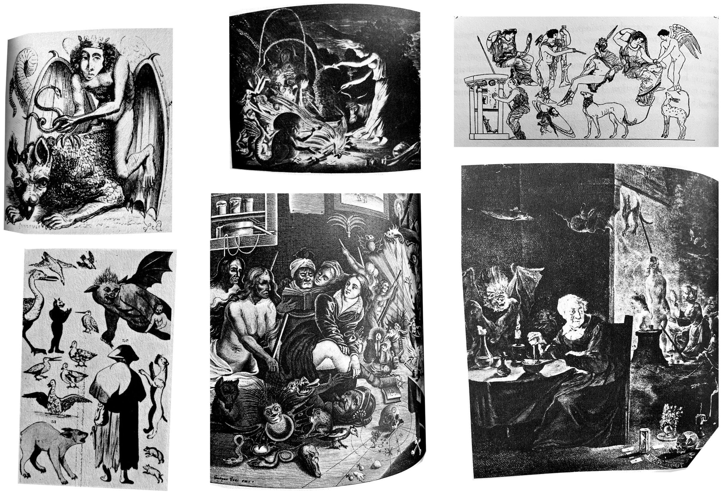
Given the album’s apocalyptic themes, a mix of art history’s most unsettling movements provided ample inspiration for the design system. Particularly Romantic-era painting, surrealism, and occult texts.
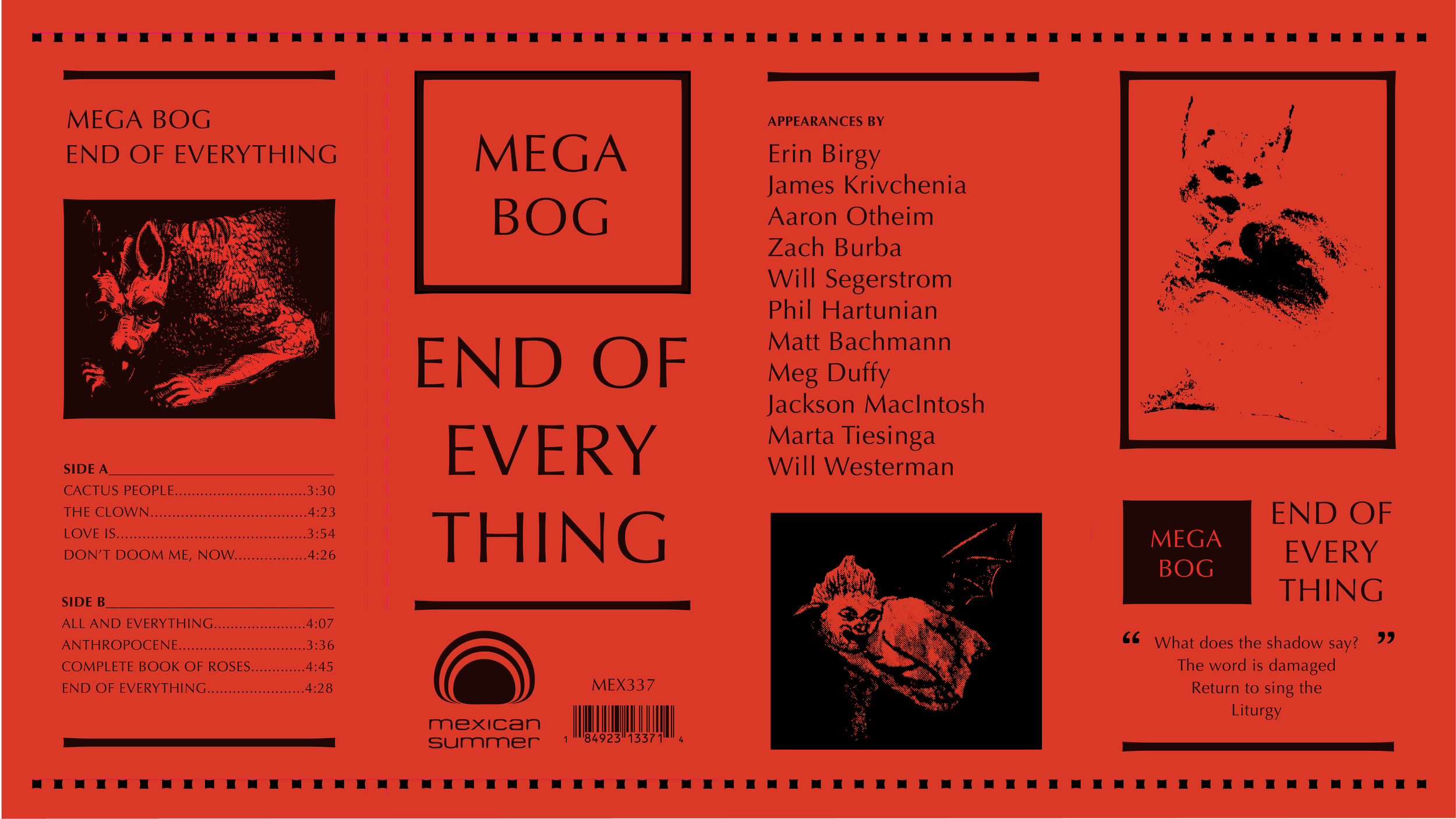
COLOR
Neon red is reflective of the urgency, vitality, and passion (whether from fear, outrage, or both) that inspired Mega Bog to make the new album. Coursing through the design system, as if drawn from the earth’s molten core, neon red visually associates the physical components and the content within to themes of fire, heat, blood, and ritual.

TYPOGRAPHY
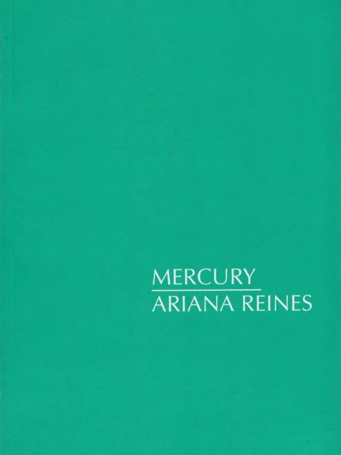
Optima, a humanist sans-serif typeface designed by Hermann Zapf in 1952, combines traditional calligraphic elements with modern geometric curves, placing the typeface slightly outside of time. We were inspired by Ariana Reines’s book of similarly world-ending poetry, Mercury.

ELEMENTS
Depictions of imps and demons from our chosen historical references are thoughtfully scattered throughout the album and book design. These creatures are often positioned to look back at the viewer, evoking a sense of curious unease about what lies ahead.

02
Artwork
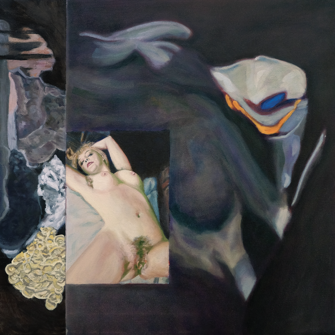
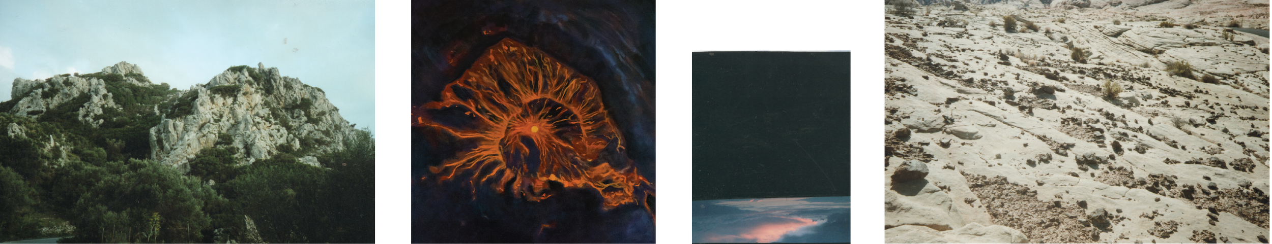
Over several months of collaborating back and forth on concepts for the record and book artwork, we developed a collage-style naturalistic painting that simultaneously inspired a sense of collective chaos and personal intimacy.

1. FIGURE PAINTING
A portrait of Birgy, painted based on a nude photograph, is the focal point — her body simultaneously embodies hopelessness and power.
2. FLOWER FORMATION
On one side of the figure, a flower-like form represents the temporality of life and beauty, the raw power and vulnerability of sex, the inevitability of death, and the purification of a departed soul.
3. ABSTRACT ROCK
On the other side rests abstracted imagery made to appear, at first glance, like geological rock formations but is, in fact, a study of melted wax burned down during moments of meditation.
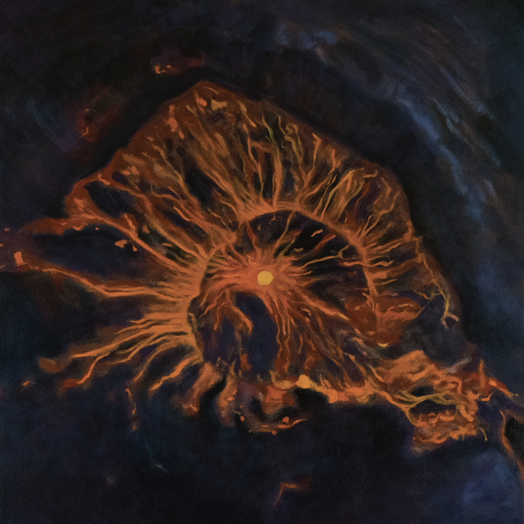
4. LAVA FLOW
The left half of the composition depicts an active, burning lava flow seen from above, letting the viewer peer into the eternal yellow portal at its core.
03
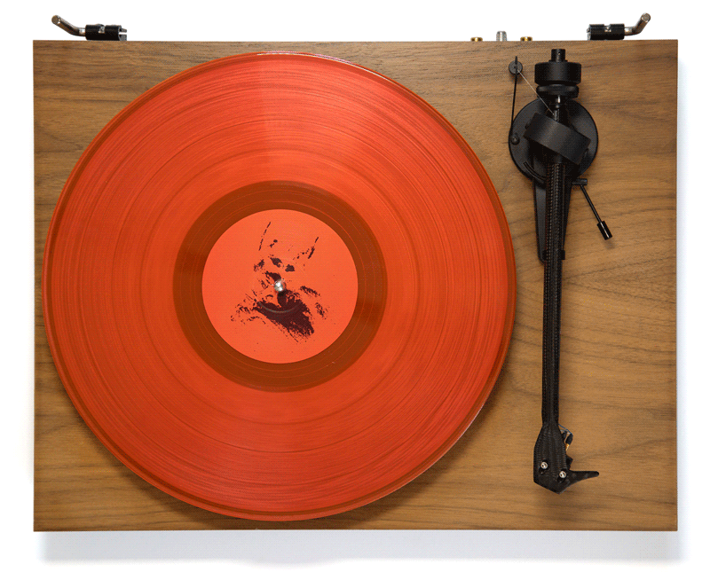
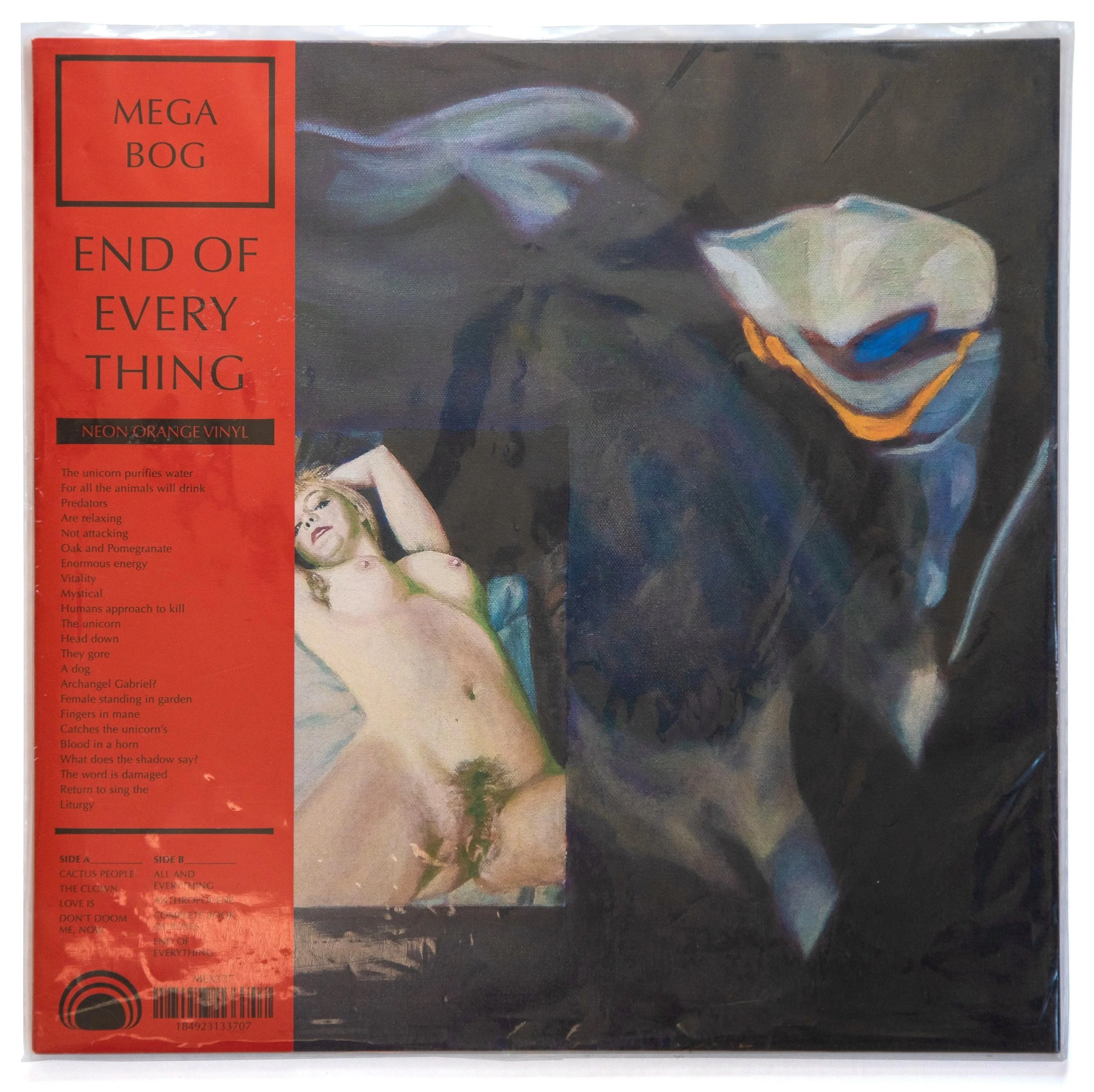
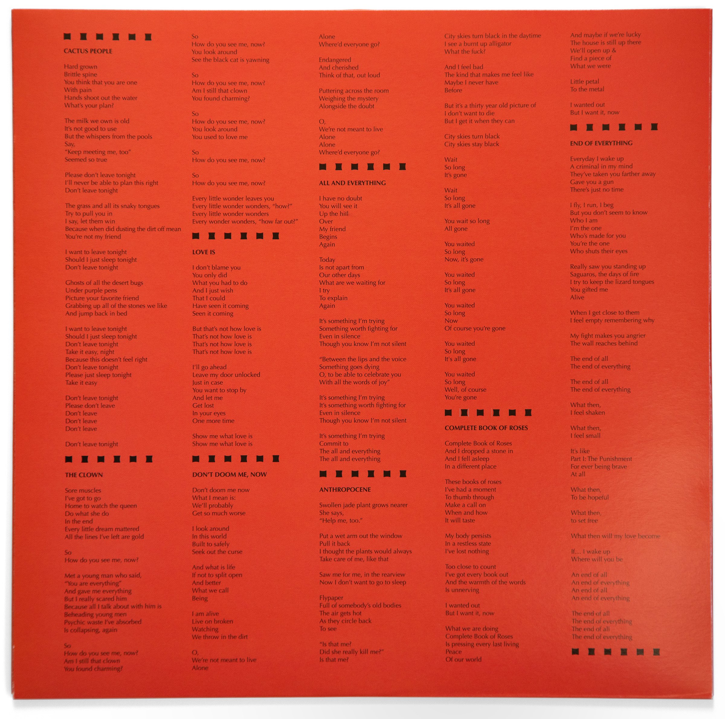
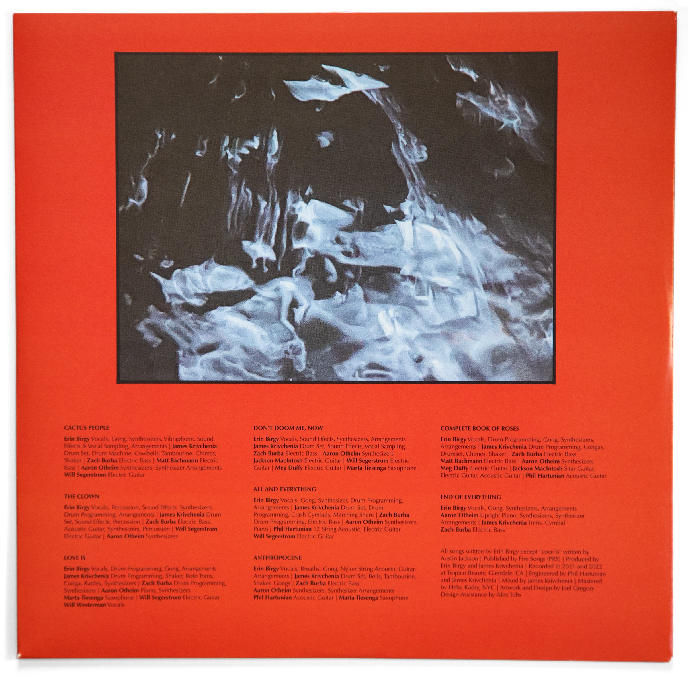
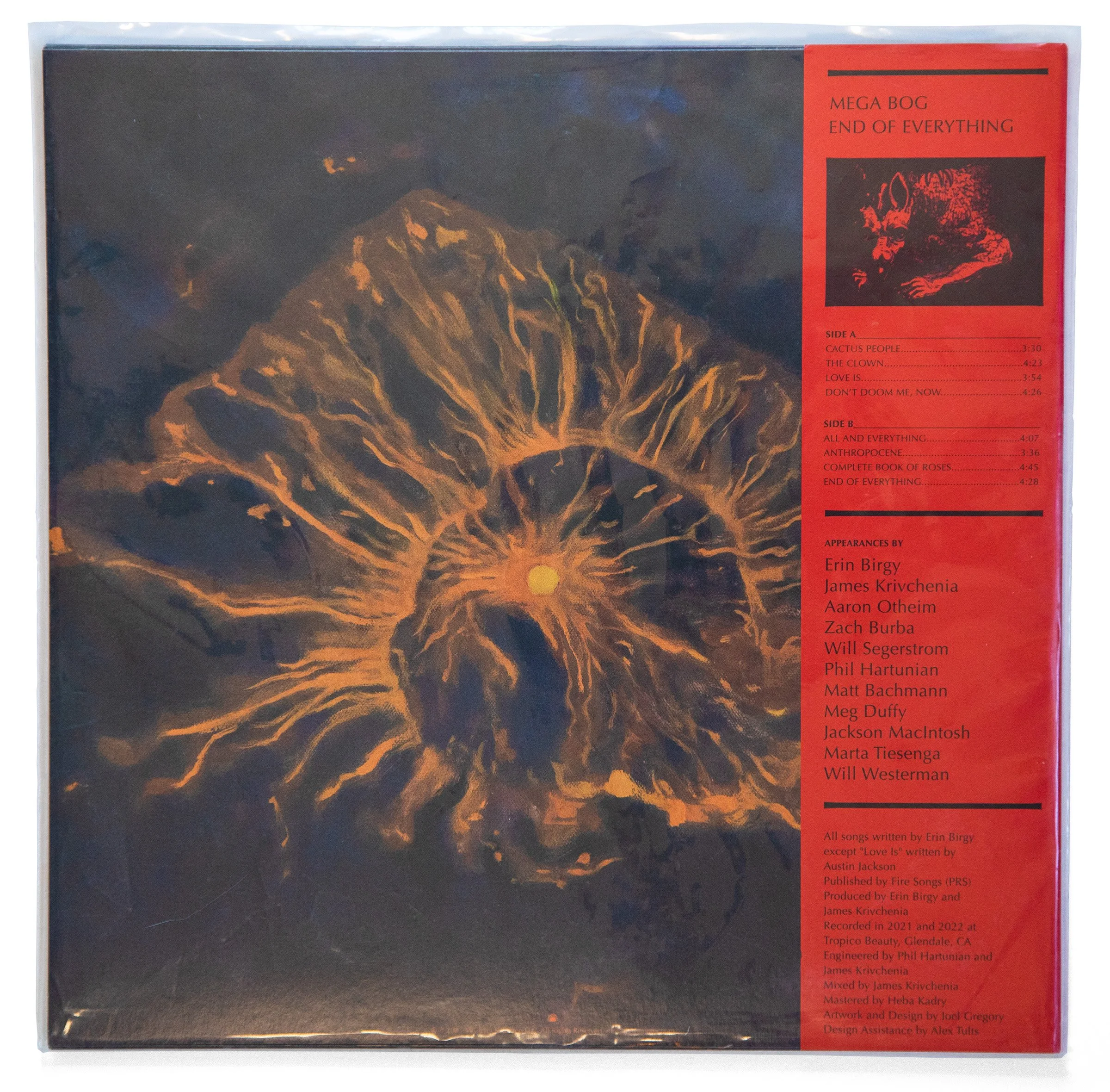
Vinyl Package
The design system and artwork combine to inform and elevate the experience of holding the album and removing the vinyl record from its sleeve. Obi strips wrapped around the left edge intentionally obscure elements of the artwork when the record is shipped. And, to add to the feeling of natural heat and urgency, the vinyl record is available in a non-traditional neon orange option.
– Obi strip
– LP sleeve
– Inner sleeve
– Record label


04
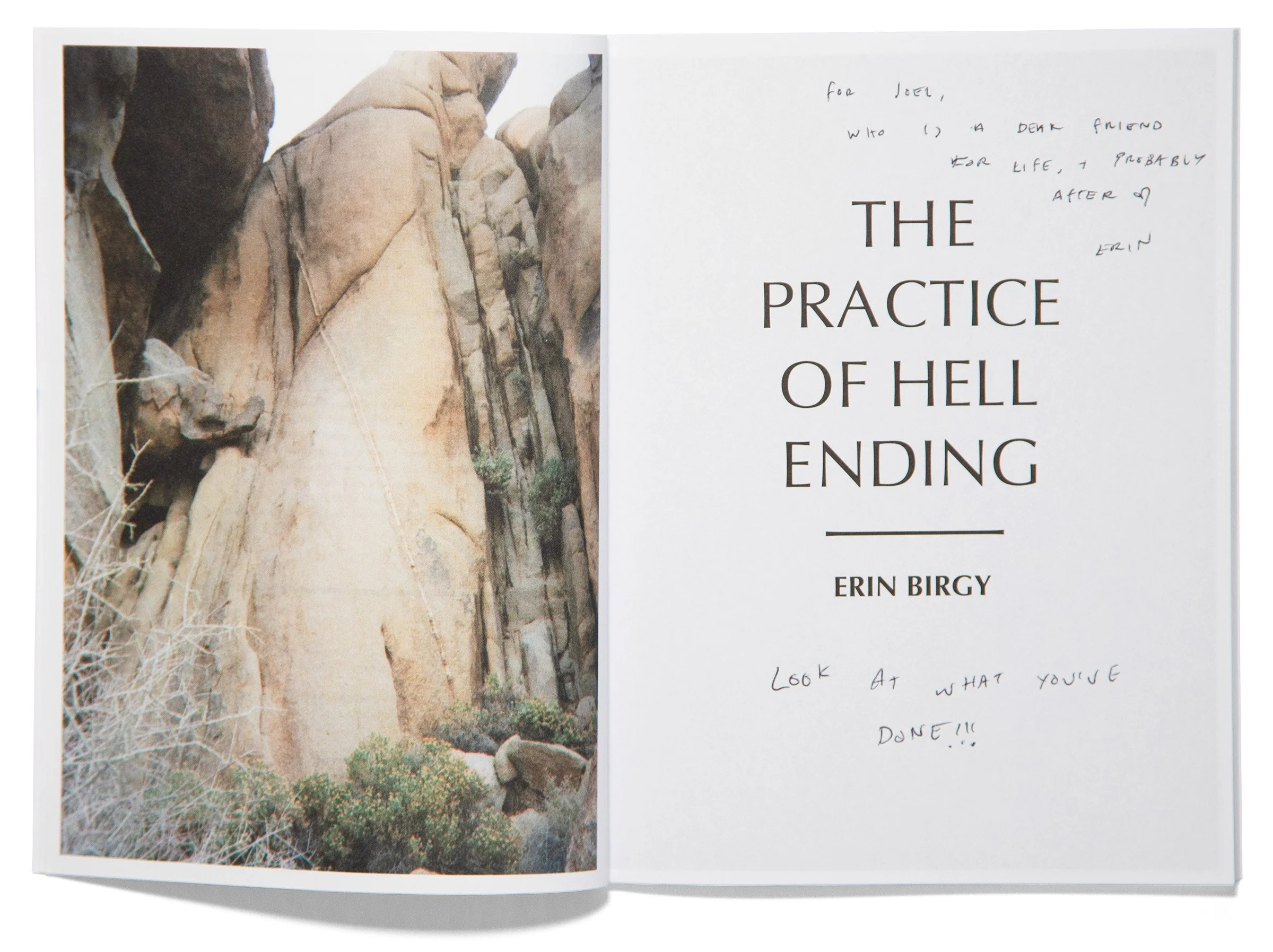
The Book
Accompanying the new record is Birgy's first published collection of poetry, The Practice of Hell Ending, which she wrote in parallel with the musical album.
The Practice of Hell Ending beckons readers to travel further into the landscapes of Birgy’s world and is meant to be a companion piece for reflection. As such, the book’s visual elements carry over much of the design system, but in a much more subdued expression.
– 6 x 8 in
– 11 color plates
– 80 pages

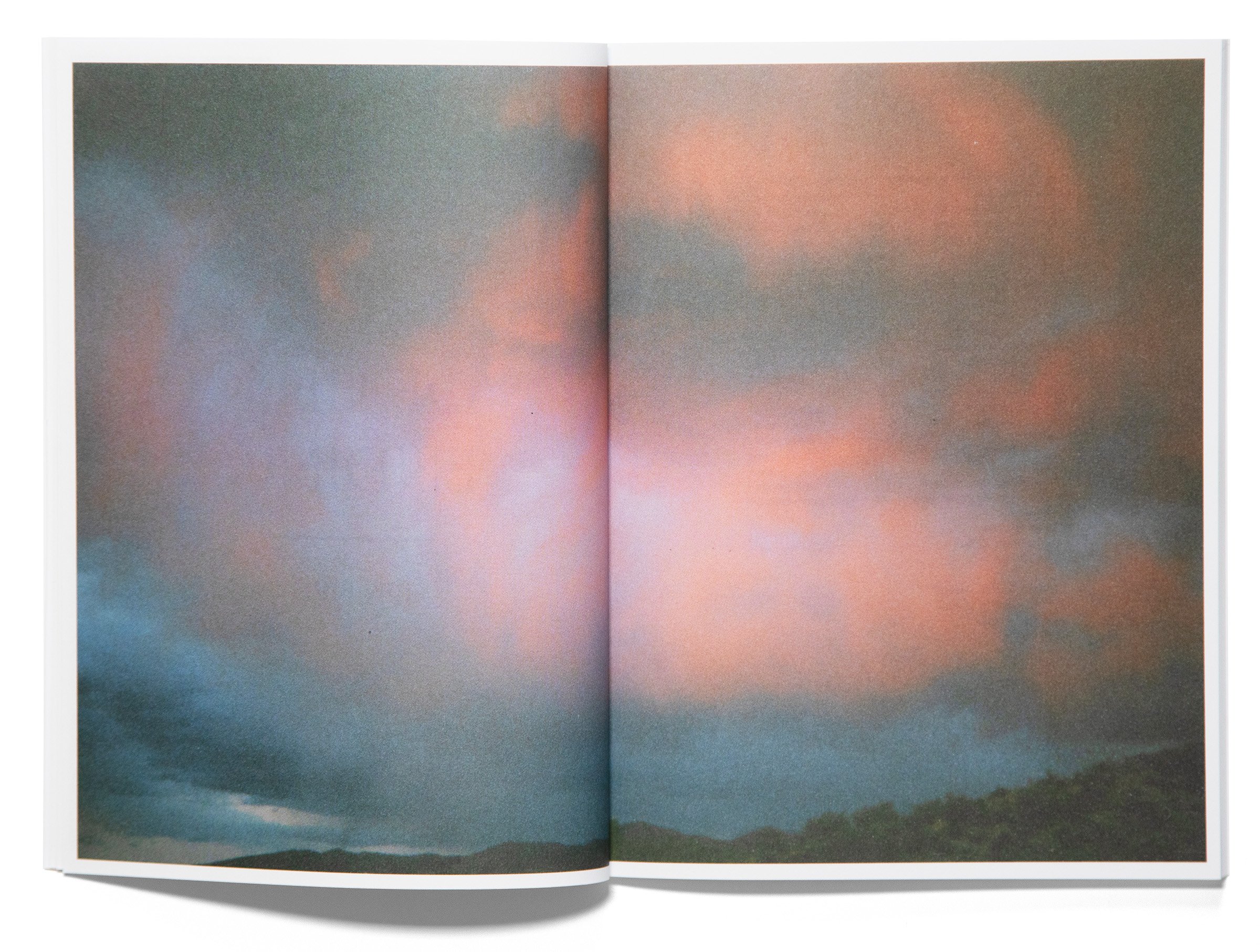


The presentation of poems and photographs symbolize a quiet care, mimicking an experiential record processed through vast landscapes. The layout brings immediate and smaller details to the forefront and ultimately enhances the listening, reading, and viewing experience of Mega Bog’s important new work as a whole.


